15 min read
The last podcast episode of 2019 ended with a promise: that I'll return in the new year with an episode that chronicled changes I made in February 2018. After making that announcement, I started thinking about the current state of the website, and how I can make further improvements.
Two troubling Questions
There were two questions that kept on resurfacing and gnawed at me over time, begging to be answered. These questions usually arrived from those who discovered Dapper Notes for the very first time, wondering: "Why are so many editions sold out?", and "What's the difference between 'latest releases' and 'special editions'?". I did my best to answer these questions directly, but they kept on arriving at a steady pace, and I knew it was time I addressed them at the core.
It was clearly time to yet again make some changes on the website. Dapper Notes grew from a temporary shop on Storenvy, to a quickly-built store on Shopify, and aside from a few minor improvements I'd made in 2018, it largely remained a mess of readily-available elements from a Shopify template. To make things worse, the styles on the website were not consistent, creating visual confusion as you'd navigate from one page to page. Needless to say it was about time I gave birth to a consistent brand voice that would guide me toward a clearer vision for Dapper Notes online.
Designing a solution
So I put on my UX hat and got to work. What came out the other end was a fantastic style guide, with a brand that has a true voice of its own, new colors that work well for a stationery company, and brand new way of organizing information on the website. I shared the wireframes in an email that was sent out mid-January, and compiled a public checklist of everything that needed get done.
So what changed?
A refined color palette
Until now, the website used a mishmosh of colors, with an odd green and a bright blue that were oftentimes supplemented with a variety of mismatched tones. Starting today, Dapper Notes is always presented with a fixed palette of gold, dark blue, and gray. You'll find the new color palette prominently used throughout the website, creating a consistency that was previously lacking.

Taxonomy
To address the two burning questions, I started by revisiting the taxonomy, which refers to the way one organizes items on a website. Instead of having several confusing categories for Dapper Notes, everything now falls into one of three places: notebooks, objects, or experiments. This change is immediately visible on the homepage and the main menu, and explains at a glance what Dapper Notes is all about. Each of the three categories is accompanied by a short description, and leads to a brand new page with all of the items relevant to that section:

Answering the burning question
To help explain why so many editions are sold out, I added an explanation on every page that lists notebooks. This appears prominently at the bottom of those pages, and should help alleviate the frequency of that question.
Starting with the Story
Who loves carousels? Well, It turns out almost no-one appreciates a banner of auto-rotating images, and according to a Nielsen study (and other researchers), fewer than 1% of people find them useful. They're a sign of lazy design (whoops!), and since I decided to be more purposeful with telling the story of Dapper Notes, I replaced the ol' homepage carousel with a ten-second looping video. So instead of something useless that existed for no good reason, the homepage tells the story of my notebooks, shows that they're a handmade item, and provides a meaningful entry into my little world.
Out of all the changes I made, this one has the potential to be the most impactful, and I'm already finding myself staring at that looping video for minutes at a time whenever I open up the website.
Beyond the new opening video, instead of jumping right into the products, the homepage now features categories, so that it's easier to ingest the variety of items that make up everything on this website.
Use the slider on the image below to compare the before and after:


High notes
There are few things as powerful as confirmation from other people. To showcase that Dapper Notes isn't a fly-by-night operation, I added a brand new set of testimonials from you that appear on the homepage, and accompany an entire page of their own. (If you have something you'd like to add there, send me a message).
Clearer listings
Every product listing page has been updated with a better view. The styles conform to the new branding, of course, but are also easier to scroll through when you're on a desktop browser. The images are no longer enormous, and each page contains 16 items (instead of 12) before you have to click onto the next listing page:

All in the details
The product detail page was another artifact of the vanilla Shopify template that I picked. The images on desktop were displayed as a giant wall that took up half a screen and felt disconnected from the information surrounding it. I also didn't tell the story of Dapper Notes well enough, and for those who arrived on the website for the very first time and directly into a product page, there was no proper introduction.
All of this changed with a better photos gallery, a special section for talking about Dapper Notes, and an updated design for edition notes. Though I attached a screenshot below, you'll definitely get a better sense of the changes by checking out a live page.


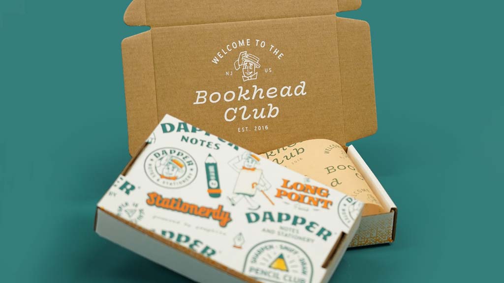
Spotlight for the star
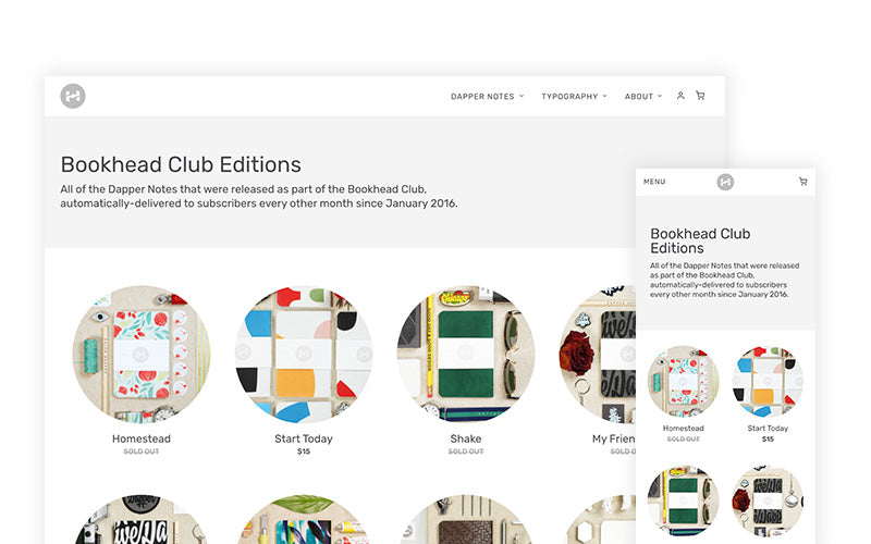
The Bookhead Club is my shining star and at the heart of everything I do. I started the subscription as a way to keep me making Dapper Notes, and it is without question the only reason why a new edition continues to arrive every other month. It stands to reason then that the subscription should receive some special treatment, which is something I actually did back in 2018 by creating a nice landing page for the Bookhead Club. That treatment worked well for two years, but as time passed, the page felt more and more like it was overdone, and I needed to take a step back so that it looked like it was part of the website but remained more special than any other product page.
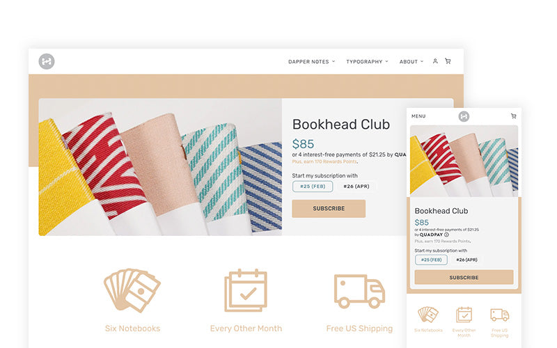
Enter the new design, which echos a lot of the visual treatments you'll spot on the regular product pages, with a few extra polishes. Beyond the top area that you see in this screenshot, I improved the Q&A interactions, designed a few new icons, and added a list of every Bookhead Club edition that was ever made.
The pricing model for the Bookhead Club has also changed. Instead of being $75 with $10 shipping, it is now $85 with free shipping for all U.S. subscribers. The cost of shipping to Canada and elsewhere is also lower now. In short, the actual cost for the Bookhead Club remains the same, it's just displayed differently now. (Check out this spreadsheet that shows how much you save by subscribing.)

Reading experience
The blog (AKA "My Journal") also got an update. The page you're reading right now was tweaked for a more refined reading experience, with changes in how the images and text are displayed.
Go up a page, and you'll see a bright new layout where all the articles are listed. Every page on the website is now in line with the new branding, and the blog is no exception.


Personal space matters
The account center on this website left much to be desired. For years it remained the only space that got no TLC. When one creates a website on which they themselves do not shop, it's easy to forget that the shopping experience does not end after an order is placed. Receiving email notifications, checking the account center for previous orders, updating addresses, and reviewing rewards points are all an integral part of the shopping experience. Yet, I'd left them in a sorry state for far too long.
Which is why I made it a priority to create thoughtfully designed emails, and an account center that feels like it's truly a part of Dapper Notes. If you've placed an order here before, go check out the fresh new look in your account, and go into an order to see how much clearer the information is presented for all of you order's details.


…and lots more
Beyond everything that I listed so far, I improved the mobile experience, fixed some issues in the cart drawer, replaced the entire set of icons that are used throughout the website, updated the "about" page, cleaned up the podcast logo, and tweaked every little thing I saw that appeared out of place or in need of refinement. I won't list them all, but I'll close with the following:
If you see anything weird or out-of-place, please let me know. And if you're still reading, thank you for following along.
You may also be interested in the latest podcast episode, where I talk about all the latest changes, and reflect on how far Dapper Notes has come.
Closing reflections
The purpose of this post is to show that the work around a product is just as important as the product itself. Dapper Notes could not exist in a bubble, and the packaging of a proper experience around my notebooks requires ongoing updates and as much TLC as creating the notebooks themselves.
This update is by no means the end of my improvements, but rather a fresh new start to help carry Dapper Notes into an exciting future. I can't wait to see where we go!
Thank you for your support. I appreciate it more than you know.
❤ - Enon